A client sends over their logo as a PNG. You need it in white for a dark background, or in the new brand colors for next week's deck and the original vector file is long gone.
Photoshop can do this. It also costs a subscription and takes an afternoon to learn if you've never opened it. For a single color change, that's a lot of overhead.
There's a faster way that runs in your browser. Here's how it works, and just as importantly where it stops working.
The technique is straightforward: you pick a color in the image, the tool finds every pixel close to that color, and swaps it for a new one. Everything else stays untouched.
That word "close" is doing the real work. Almost no image contains one perfectly uniform color. Even a flat logo has slightly different pixel values along its edges, where the shape blends into the background. Gradients contain hundreds of shades of what your eye reads as a single color. So the tool needs to decide how wide a net to cast and that's a setting you control, not something it guesses at.
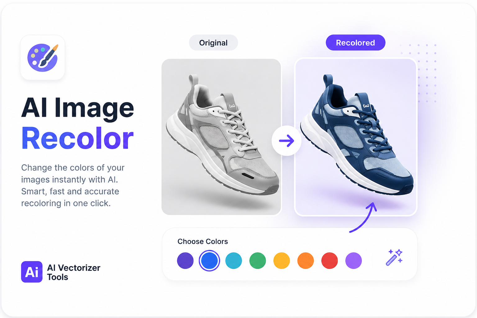
This is a different technology from the AI recoloring tools built for photographs. Those use segmentation models to identify an object a shirt, a car and re-render it in a new color while rebuilding the lighting. That's the right approach for a product photo. It's overkill for a logo, and it's slower and more expensive to run.
For flat graphics, color replacement is the better fit. It's precise, it's instant, and it does exactly what you tell it to.
1. Upload your logo. PNG works best. If you only have a JPG, read the section on file formats below first it matters more than you'd expect.
2. Click the color you want to change. A magnifier appears so you can target the exact pixel rather than guessing. This is worth using; clicking a pixel one shade off from what you intended is the most common reason a swap doesn't look right.
3. Pick the replacement color. Enter RGB values directly if you're matching a specific brand color. If your brand guide gives you a hex code, convert it most color pickers accept either, and RGB gets you an exact match rather than something that looks close.
4. Adjust the tolerance. This is the part that determines whether the result looks clean or broken. Details below.
5. Download. The whole process runs on your device the image is never uploaded to a server, which matters if you're handling client work under NDA.
Try Image RecolorMost guides skip this. It's the single setting that separates a clean result from an obviously edited one.
Tolerance controls how far from your selected color the tool is willing to reach.
Set it too low and you only catch the exact shade you clicked. On a logo with any gradient or soft edge, you'll see the new color appear in patches while the surrounding shades stay stubbornly original. The result looks torn rather than recolored.
Set it too high and the selection spills into colors you didn't intend to touch. A dark navy and a black outline are numerically closer than they look, and at a wide tolerance the tool will treat them as the same color.
The practical approach: start in the middle and adjust based on what you see. If parts of your target area are being left behind, raise it. If colors elsewhere in the image are shifting, lower it. Two or three adjustments usually lands it.
Logos with gradients need more tolerance than flat ones, because a gradient is genuinely many colors that your eye groups into one. If your logo goes from deep purple at the top to a lighter purple at the bottom, a narrow tolerance will only catch one end of that range.
Being honest about the limits saves you time.
Anti-aliased edges. Logos have softened edges so they don't look jagged on screen. Those transition pixels are blends of the shape color and whatever's behind it. Depending on tolerance, some may not get swapped leaving a faint outline of the old color. Usually invisible at normal size, occasionally visible when you zoom in for print.
JPG compression. JPG doesn't store exact colors. It approximates them, and the approximation is worst around high-contrast edges exactly where logos live. What looks like a solid block of one color in a JPG is often dozens of slightly different values. Color replacement fights this the whole way. If a PNG version exists anywhere, use it.
Photographs. If you're trying to recolor a shirt, a piece of furniture, or a product shot, this isn't the right tool. Photos carry lighting, shadow, and texture information that a color swap flattens. You'll get a result that looks painted over rather than genuinely re-shot. Use a segmentation-based AI recoloring tool for that job.
Multi-tone logos where you only want one element changed. If the same color appears in two places and you only want one changed, color replacement will catch both. That's a vector editing job.
Recoloring a PNG is a patch. You get the file you need right now, and the next time someone asks for a different color, you do the whole thing again.
In a vector file, color isn't stored per-pixel it's a property of each shape. Change it once and it's exact, everywhere, at any size. No tolerance to tune, no edge artifacts, no compression noise. Open the SVG in any vector editor and the color becomes a field you type into.
If you're going to need this logo in multiple colors, or at multiple sizes, converting it to vector first is the better order of operations. It's more work once and less work forever after. It also solves the resizing problem at the same time a raster logo blown up to billboard size falls apart, which is a separate headache worth understanding.
For a one-off change on a logo you'll never touch again, a direct color swap is fine. Match the effort to how long you need the result to last.
Photoshop gives you the most control, particularly when you need one instance of a color changed and not another. It's the right tool for genuinely complex work. It's a subscription and a learning curve for a five-minute task.
Canva handles basic color adjustment and is convenient if your design already lives there. Less precise for exact brand matching, and awkward if you just need one file changed.
A vector editor Figma, Illustrator, Inkscape is the correct answer if you have the SVG. Free options exist. The catch is that you need a vector file to begin with, which is usually the exact thing you don't have.
Yes. Image Recolor runs in your browser and uses no credits.
It works, but results are noticeably worse than with PNG because of compression artifacts around edges. Track down a PNG if one exists.
Yes — enter the RGB values directly rather than picking from the color field by eye.
No. Processing happens entirely on your device.
Yes — select the logo's color and replace it with pure white (255, 255, 255). If the logo sits on a white background, export as PNG with transparency first, otherwise the background will be selected along with the shape.
Image Recolor runs in your browser and uses no credits.
Changing a logo's color doesn't require design software or design skills. Pick the color, pick the replacement, tune the tolerance until it looks right, download.
Use color replacement for flat logos and icons where you need a quick result. Convert to vector when you'll need the logo in several colors or sizes over time. Reach for a photo-focused AI tool when the subject is an actual photograph rather than a graphic.