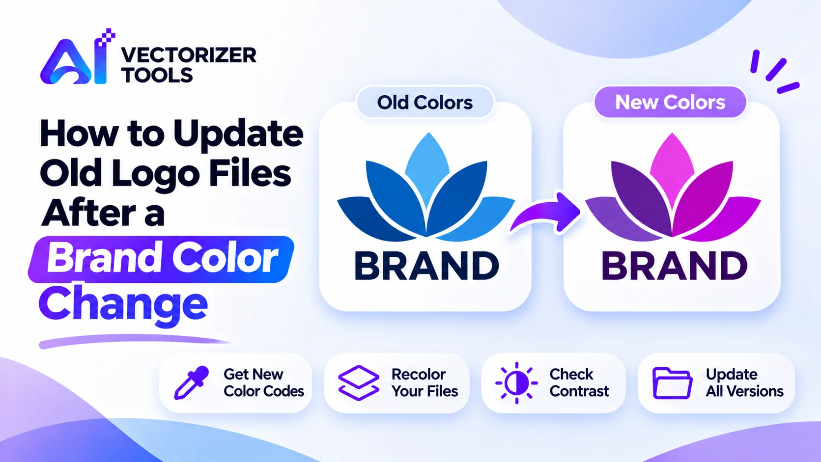
Adopting new brand colors suddenly renders all existing files containing the logo — website headers, social media avatars, email signatures, invoices, and slide templates — obsolete. Here is an efficient method for updating them without having to start from scratch.
List every place the logo lives and note the file for each. Group them as flat-color logos (the easy ones) and files with gradients or shadows (harder).
Write down your new brand colors as hex codes. Use the same codes everywhere, so every file matches.
Click the old color and replace it with the new hex value.
Work through every color in the logo one at a time.
Zoom in on the edges to check for leftover fringes of the old color.
Export with a clear, versioned file name.
This works best on logos made of flat, solid colors. Gradients and shadows don't recolor cleanly, so those files may need to be redrawn. For a step-by-step walkthrough, see changing a logo's color without Photoshop.
New colors can look good alone and fail on a background. For text and small logos, a contrast ratio of at least 4.5:1 is the accessibility guideline for normal text. Test the logo on white, on dark, and on your brand background.
Keep a transparent-background version for use on different colors. See how to make a transparent PNG logo.
Swap the new files into every location on your list. Delete or archive the old versions so nobody uses them by mistake. Keep one master folder with every format and size.
Tip: If you have the original vector file, edit the color there. Recoloring a PNG is a good fix when the original has been lost.
You won't update everything on day one, so start with what customers see most. A sensible order:
Most brands need more than one version of the logo. When you update, make sure each version gets the new colors.
| Version | Used on |
|---|---|
| Full color | Light backgrounds, the default |
| Reversed (light on dark) | Dark backgrounds, photos, video |
| One color (black or white) | Stamps, embossing, fax-style documents, cutting |
| Icon only | Avatars, favicons, app icons |
Accessibility guidelines recommend a contrast ratio of at least 4.5:1 between normal-sized text and its background, and a ratio of 3:1 for large-sized text. Logos are subject to more flexible rules, but the principle remains the same: if your new color is too close to the background color, the logo will become difficult to read. Use a contrast checker tool with your hexadecimal color codes before making a final decision, and test the logo against all the backgrounds you use, from white to the darkest shade in your brand's color palette.
When you use Image Recolor, a few habits keep the result clean:
If your logo has gradients, shadows or glows, recoloring will be unreliable. Those files are better redrawn from the original vector or design file.
A one-page brand sheet saves valuable time down the line. It should list every color along with its hexadecimal code, the name of each logo file and the context in which it should be used, the minimum required size for each version, and the date of the last update. This way, anyone tasked with creating a flyer, a slide, or a social media post can independently select the correct file, without needing to ask any questions.
A change in color may seem trivial, but it has repercussions for many different elements. For a small business, a pragmatic approach is to prepare all the files for the new logo in a single afternoon, then update digital assets over the following week starting with the website and social media profiles. For printed materials, the timeline is generally different: you might choose to use up your current stock or simply reorder with the new design at the next convenient opportunity. Inform your team of the date when the new files officially take effect to ensure the old logo isn't still being used out of habit. A brief announcement across your various communication channels will also help your customers recognize this new visual identity, rather than leaving them to wonder whether something has changed.
Swap in your new brand colors and export a clean, versioned file in seconds, no gradients or shadows to redraw by hand.
Recolor your logo →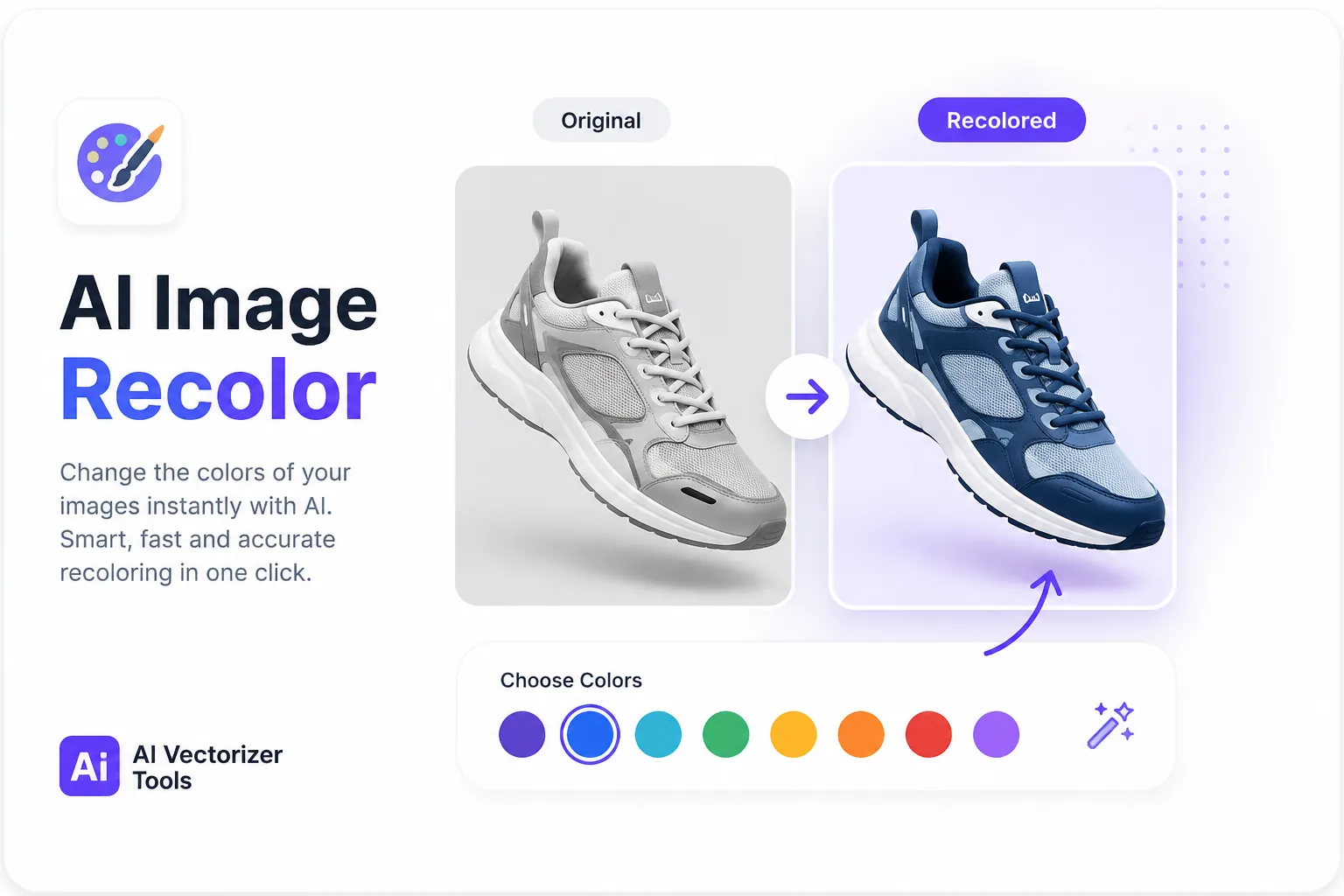
How color replacement works, the tolerance slider, and where the technique stops working.
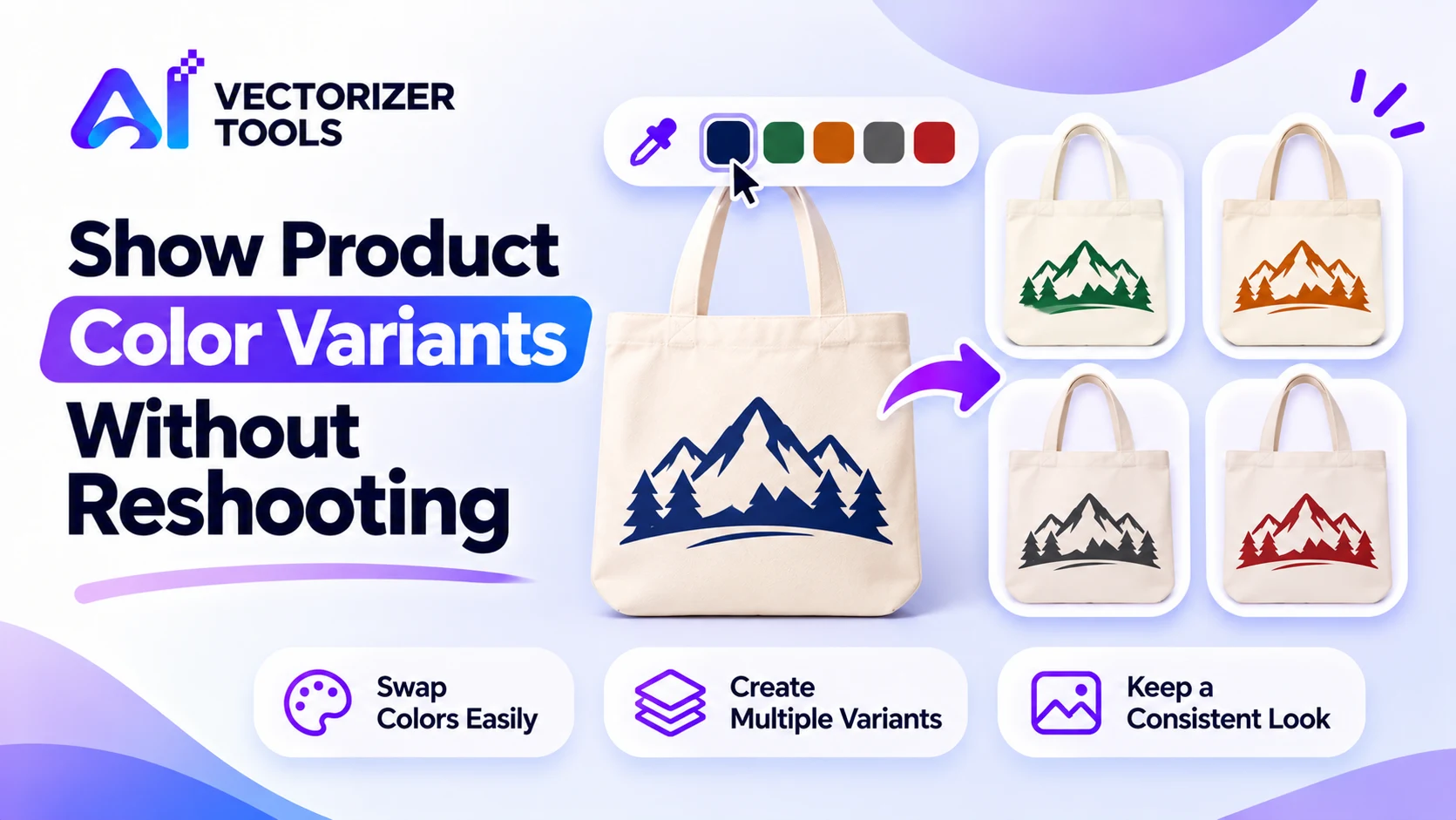
Create color variants of flat product artwork and mockups by swapping colors in the browser. Learn what works, what doesn't, and how to keep it believable.
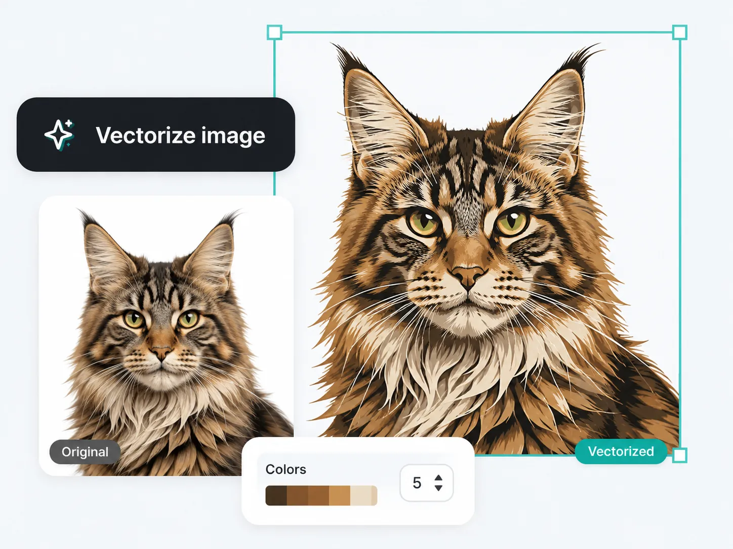
Why JPG logos break down when scaled, and how vector tracing fixes it for good.
Not cleanly. A simple color-swap works on flat colors; gradient logos usually need to be redrawn.
Archive them somewhere separate so they can't be used by accident, but don't mix them with current files.
Keep a transparent PNG for general use, a larger master file, and an SVG if you have one.